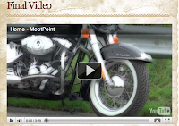
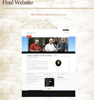
This is my final website design, I used my dad's (Steve Pettitt) software to design my website in as i found it easier than Adobe Dreamweaver. I changed the colour of my background to a much more subtle colour, which is not in your face but still looks effective.
In what ways does your media product use, develop or challenge forms and conventions of real media text?
Camerawork
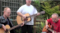
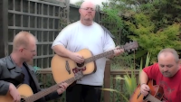
Throughout the entire project I tried to apply most of the music conventions of Folk Rock/Indie/Acoustic into my music video. The main convention that I tried to incorporate into my video was a mixture of camera angles and camera movements. I wanted to include different camera angles and images so when they were sequenced together, they would have a significant impact upon meaning. I created different camera angles to emphasis the atmosphere within the video, and to help to audience understand the loss that the lead singer, Dave, is going through. I did this by using close up and extreme close ups of Dave on the chorus, and where the lyrics were the most touching. To create a more dynamic feel to the performance I included a 360 degree Pan movement, which circled the band as they were performing the song. This was not the only movement I used within the video; I used a fair amount of tracking shots and zooms to add to the dynamic feel.
A wide variety of close ups were used to predominate and to create a sense of intimacy for the viewer. By using a variety of close ups it emphasises half of the commodity on sale (not just the song, but the artist, and particularly the voice). I used this convention throughout, particularly when the lead singer, Dave is singing the chorus as I wanted to capture the emotion within his eyes and voice. Camera angles and movements are not the only thing that make the video interesting but the lighting which emphasises the mood and atmosphere. John Stewart of Oil Factory said that he ‘sees the music video as essentially having aesthetics of the TV commercial, with lots of close ups and lighting being used most prominently for the star’s face’.
Snow Patrols 'Run' is a very moving and sad piece of music; it is very touching as the lead singer has a good melodic voice. This video was one of Snow Patrols biggest songs, when released the audience had mixed opinions on this song. The reason I chose this video was because it was being portrayed with lots of 'close ups'. Throughout the entire song, there is a mixture of camera shots, varying from close ups to master shots. The camera focuses on the lead singer as he is singing the chorus, which inspired me to repeat this in my music video.
Lighting
Another convention is to use a well-lit location; I mainly used my house as the light was seeping through the windows and lit the room up. I had to wait for the right time to film my video, as sometimes the lighting was too dark or too bright. I waited until it was a clear enough day and the lighting was right, to shoot the interior shots for my video. To shoot the external shots I used my garden for another form of light which was ‘Natural Light’; this was shot in the middle of the day so I had as much light as possible entering the camera lens. The reason I shot this in the middle of the day was because the sun was at its highest and was perfecting for what I wanted. Shooting my video in the early morning or at night time wouldn’t have worked, as it will be dark and the audience will not be able to make out the video. Another reason why I had to wait for the right time was because of the changes in weather, I didn’t want it to be raining or snowing when shooting my video. I used this convention to emphasise the emotion in certain parts of the video, such as at the start. I used natural lighting, to cast a darkened effect on Dave’s face when he is singing the song in depression. This adds to the overall effect of being a sad and emotionless video. Therefore, there is plenty of light on set; this then conforms to the theory of Richard Dyer –which gives the impression to the audience that the singer is seen as the main idol on screen.
Bryan Adam's video 'Please forgive me' was filmed in a recording studio, with natural lighting coming from the lights above them. I thought this video was perfect for an example of lighting, as it is mainly shot inside, it shows that you can still film a good music video when the lighting is natural and dimmed. This is very similar to my video in the sense of lighting, I filmed my music video in my house, and the lighting was perfect, but I also filmed some external shots, which were still natural lighting, just shot outside using sunlight instead of electricity. In comparison to Bryan Adams video, the lighting I used was brighter and vibrant compared to the studio lighting in ‘Please forgive me’. The lighting in both videos worked well for different reasons, my video I wanted to create an emotional scene, to where to light was focused carefully on Dave’s face to show the emotion within his eyes and face. In addition, in the Bryan Adams video the lighting is focused on the whole room, instead of an individual person.
Editing
The most common form of editing associated with the music promo is fast cut montage, rendering many images which are impossible to grasp on first viewing thus ensuring multiple viewing. However, there are some videos which use slow pace and gentler transitions to establish mood and atmosphere. This is particularly apparent for the work of many female solo artists which has a broad audience appeal, such as Dido. I used both fast cuts and slow cuts within my video, slow cuts were established at the beginning to emphasise the mood and to let the audience see the emotion within the song. I then developed to fast cuts to build up the suspense and tension as the video draws to an end.
Narrative and Performance
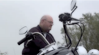
Almost every music video has the 'repeatability' factor within the video, this means the audience can view the video as many times as they want and notice different conventions every time they watch it. I conformed to this theory as I included a narrative, in the sense that the audience can make their own mind up on the video. As the video has a rough narrative, the question is who the lead singer (Dave) is mourning? I left this up to the audience to decide, to see if they can work out the story within the video. I used the repeatability factor by repeating shots of the motorbike, from different angles to represent that Dave is depressed and emotionless. As Steve Archer states “Often, music videos will cut between a narrative and a performance of the song by the band…" Archer continues "Sometimes, the artist (especially the singer) will be a part of the story, acting as narrator and participant at the same time. But it is the lip-synch close-up and the miming of playing instruments that remains at the heart of music videos." I developed this convention as I got the band to perform live, instead of lip synching. … By having a lyricist as the main performer, Dave is experiencing the death of his wife and is acting the role out as well as performing a song about the whole tragedy. With the lip synching I wanted to make the video look as realistic as possible, I did this by making Dave sing over the original song and then cut the audio out later on in the process. I wanted to create the sense of believability, and professionalism, which is what you would see in a real music video which is broadcasted on MTV. I achieved this by overlaying the audio with the song and cutting the audio out.
How effective is the combination of your main product and ancillary texts?
Throughout my whole project I tried to link all three ancillary tasks together by using various aspects, such as font, colour, theme and image. My music video is my prime project and I wanted to link the CD and website together. As I chose to film my music video in black and white, I wanted to relate my CD to my movie, so I continued with the theme of black and white, to an emotional and realistic piece. Using black and white for my video and CD, helps to build on the emotional atmosphere. The shots are drained from colour which suggests unhappiness and sadness, which is the theme I was aiming for at the start. This relates back to my audience, as this would be the type of effect you would come across with Folk Rock/Indie music. The audience would also be able to see the similarities between my video and my CD, which together advertise and promote the band. The overall image was perfect for the front cover of the CD, it’s a well-lit, effective shot and photographed at an usual angle, which relates back to my music video, as some of the shots I used in my video are unusual, this combination is very effective as I have used effect and unusual shots in my video and incorporated them into my CD as well.
The combination between my CD and my website is different, as the CD is in black and white but my website is in colour. The reason my website is in colour, is because if looks more effective and authentic, rather than in black and white. The website didn’t look professional in black and white, plus you don’t see many websites done in black and white these days. The CD is promoting the band and the music they are performing; it contains imagery and hardly any text. Whereas the website gives the audience the inside scoop on the band, such as the history of the band, tour dates, about the latest album, lyrics to the song and about the video ‘Home’. The combination is effective and works, as the CD is advertising the band through imagery and the website offers other information to the band if they want it. I kept the same sized font and the same style of font, as it is clear for everyone to read and the audience will understand it better. Another effective combination between my CD and website is the use of quotations; on my cd I quoted lyrics from previous songs the band had recorded and on my website I quoted some of the comments the band member said. By listing the song titles on the website and on the CD, it gives the audience an idea of who band member plays what instrument and how keen they are to promote their music and launch their career. I found combining the lyrics on the website and on the CD, added an artistic and creative feel.
The main combination between my website, CD and my video is the imagery; I used the imagery from the video and incorporated that into my CD, to create and emotional and authentic feel. I also used some of the images from my CD and changed them into colour to add to my website as they looked more effective in colour than in black and white. Overall the CD and website promotes the band in various ways, the imagery suggests a close bond between the band members which is represented through photographs being displayed. The lyrics are moving and emotional which is shown through the performance in the video and the quotations on the website and CD, this also shows they are a willing band and want to make a good career out of it.
What have you learned from your audience feedback?
Music Video Feedback
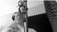
The audience feedback I received was both positive and negative. For our music video's we each watched each other’s and wrote down what we liked, disliked and what that student could do to improve. I thought that this was the best way to get honest feedback from everyone about my music video. With there only being eight of us in a class (including me), there wasn't much feedback given, so i had to make do with the feedback I received. By receiving negative feedback, it helped me to understand where my weaknesses were and what I could do to improve my video. Most of the class said that 'they liked the eye shot, it was interesting and realistic'.This piece of feedback was very positive, as most of the class was impressed about how I managed to do it and keep a steady hand, whilst shooting an extreme close up of an eye. I thought this shot went really well, as it is hard for the model to stay still and have a camera pointing into their eye at the same time. Even though the camera is slightly out of focus, I am still pleased with the shot, as no one else has done it and it works well with the timing of the song.
Personally, I both agree and disagree with this comment; I agree that it looks very interesting when overlaid with the audio track. It's very realistic and natural, it shows a different side to the character and it's an unusual shot to capture. However, I also disagree because; the camera is slightly out of focus. I tried to focus the camera on Dave's eye, but as the camera zooms in, you can slightly notice that under the eye is out of focus and the side of his face is in focus.
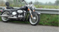
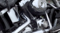
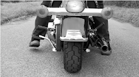
Another piece of positive feedback was the 'Cartoon styled video which created a colourful dream land, which worked well with the black and white feel'. This piece of feedback was very positive and I agree with what the other students stated. As my video was in black and white, cutting to a colourful dream world worked well with the overall performance. My intention was to film a black and white music video; I chose to film this in black and white as the chrome on the motorbike stood out, dominating the rest of the screen. Whilst filming in black and white, I wanted to combine the two together and create a fantasy, dream world where everything is perfect and everyone's happy, which also fits in with the story of my music video. Instead of cutting back into colour, I decided to stylize the video into a cartoon effect which worked incredibly well, and then cuts back to the ordinary, dull and silhouetted world. This would portray two different worlds, one where everything is dull and darkened and the other which is full of vibrant colours and happiness. So I combined the two together to create this video. My personal feelings on this shot is that it looks very authentic and crazy, I wanted to add some colour into my video and this shot was the perfect opportunity. I also like how the timing of the colour shots fit with the lyrics and story behind the song.
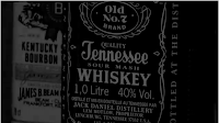
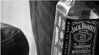
The most positive piece of feedback that I received was the 'Jack Daniel's shot; it’s interesting how it fades together and looks creative and unique'. I agree with what the other students said about this comment, this piece of footage was the one that stood out the most within my video. Originally my intentions were to capture the cupboard door opening and focusing on the Jack Daniels bottle. However, when it came to actually filming this section, I adjusted the lens focus and slightly blurred the image as the door opened and then focused the camera back on the bottle. Personally, I think the blurred image creates a whole new effect, which works well with the story line and other camera movements. I don’t think I could have filmed this shot any different, I think it works well as it stands now. Personally, this is my favourite shot out of all the ones I shot, the effect and focus of the bottle works incredibly well. I like how the camera focuses on the Jack Daniels bottle, until it is removed and then focuses on another alcoholic drink behind it.
Another piece of positive feedback I received for my music video was there is a good use of different camera angles and camera movements, which formed an outstanding video.'I both agree and disagree with this reference; I agree that I used various camera angles, so I could create some interesting effects. However, I could have included some more exterior shots, or higher angled shots, to increase the power behind the song. Overall my intentions were to include as many close ups as I could, as most music video consists of close ups and focus on the lead band member, which is what I tried to represent within my music video.
‘Overall quality was outstanding, framing and composition of camera angles were incredible, shot variety, camera movement and placement was fantastic and the use of external locations and control of mise en scene was outstanding’. I received this comment from my teacher and I completely agree with it, I tried to incorporate as many aspects to my video as I could. The quality of the video was one of the most important aspects I had to cover; I wanted my video to be authentic and professional. The framing and compositions of my camera shots was another important aspect because the video could look plain and simple, if you don’t have some interesting camera angles within. I wanted to stick with what the theorist (John Stewart) stated about close up camera movements and angles. I am pleased with most of the shots I portrayed especially the extreme close up (Fade) of the Jack Daniels bottle in the cupboard. External locations was the biggest aspect of filming a music video, I wanted to be experimental with the external shots. I thought carefully about the lighting, camera positions, scenery and mise en scene, so that when it came to filming, the location was perfect for the work I was about to portray. My intentions were to create a fantastic video, to which everyone would think ‘That’s incredible’ and get some ideas of what they could do with their work.
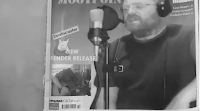
As well as receiving positive feedback, I also received some critical feedback, which I thought was very helpful as I could improve my video and stand a better chance of getting a good grade. The first piece of negative feedback was 'The magazine scene, the camera is shaking and not up to the standards as my other camera work.' I completely agree with this statement, when playing the video back to myself, I realised that it was shaky and wasn’t up to the standard as my other shots. My intentions for this part of the video, was to create a realistic magazine cover, with the lead singer of 'Moot Point' on the front, with an exclusive headline next to him. I designed all of this in Adobe Photoshop, and I used the original 'Guitarist' magazine for reference. I refilmed this section of the video, but I camera across some synching problems when fitting the clip in the video, which I managed to sort out. I agree with what the audience fed back to me, the shot was a little shaky and it let that scene of the video down. However, I have re shot this section and it is available on my blog to have a look.
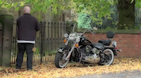
The most talked about piece of negative feedback was 'The photo frame at the beginning, you cannot tell who he is mourning'. Some of the other students suggested that I should have an insert shot of the photo frame, so the audience could establish who the lead singer is mourning. I disagree with the statement as my original intention was to create a music video, with an emotional storyline. It is obvious that the lead singer (Dave) has just lost somebody, due to the sadness within the video and the magazine article on the front page. 'Moot Point’s lead singer loses wife in tragic motorbike accident'. I wanted to keep it mysterious and to see if the audience can work out what has happened, and why he is so depressed and results to drinking to comfort him. Another suggestion was that I could insert a shot of Dave and his wife riding on the motorbike as a flashback. However, when it came to receiving this feedback, the lead singer was in America for three weeks and I was unable to film any more. I kept this part of the music video the same, as this is want I wanted originally, and personally I think an image would give the whole story away, or make it to obvious and the audience would be focused on the loss of one person, rather than an alternative grief which is what I do not want.
'The zoom out of the artist’s eye is too quick' this was an interesting piece of feedback, as I completely disagree with it. The whole idea of this scene was to have a slow zoom into Dave’s eye as we enter a dream world, which is full of colours and happiness. Then a fast cut out of the eye and back into reality, I wanted to represent opposites here and create an unusual effect. The fast cut shows that something has pulled him out of his dream world, and back into reality, which is why I used a fast edit to represent this.
CD Feedback
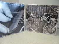
My CD received some positive and negative feedback, but not as much as my music video. My first piece of positive feedback was 'The use of photographical imagery was professional and effective and the whole layout of the CD looks professional'. When receiving this piece of feedback it made me proud as I was a little worried about what people was going to say about it. I completely agree with this reference, as I take A2 Photography I had a slight advantage of capturing the best imagery for my CD. I used my photographical skills and created some unusual angles, which is why I used these images on my CD. I think the whole CD is very proficient and the imagery works well with the theme of my project. I especially like the image on the front, I think the reflection on the base of the guitar shows a whole different effect and works well with the rest of the imagery.
For my front cover of my CD, a friend stated that she 'liked the angle of the shot and the reflection in the base of the guitar'. My intentions were to have a distinctive image on the front, which would fascinate the audience at the first sighting. I was really lucky to achieve this shot as the lighting was just right as it hit the base of the guitar and gave an outstanding reflection. I stuck to my theme of black and white, as the imagery on the CD stood out and looked proficient.
The booklet inside of the CD is combined of all different images ranging from images of the band members to photographs of the motorbike used within my video. The same friend quoted'The booklet is filled with outstanding imagery; I especially like the double image in the middle of the book'.I agree with this comment as well, as this is the most realistic image throughout the entire booklet. On the middle page I wanted to include the lyrics of the main song to establish the meaning behind the song. I shot around 100 photographs; I then selected the best images out of that selection and narrowed it down to get the best quality images for my CD. For my booklet inside, I wanted to create a booklet of style and classic imagery. I am pleased with the images I used for the booklet and I think that the black and white shows off the chrome on the motorbike well.
'The CD label looks professional and creative'.I totally agree with this feedback, as I wanted to make my CD as professional as possible, I thought about creating a label to go along side with the CD package. However, another adult commented 'The writing of the titles is too small; it could be a little bigger'.I also think the CD label is very authentic and creative, as I have used an image on the neck of the guitar, this represents the other imagery used, which I thought worked well. I also agree with this comment, but if i made it any bigger than it already was it look out of proportion and stretched.
Finally the back cover was the panel that received the most feedback out of the whole CD, One student said that 'The photograph on the back looks incredible and fits with the whole theme'.Another person stated that 'The angle of the bike fits with the layout of the titles'.I agree with both of these comments, as that is what I wanted to achieve from the beginning. Overall, I received a lot of positive feedback, to which I hope people can relate to mine and use some of my ideas in the future.
Website Feedback:
For my website feedback, I asked older people to analyze my website and give me some possible feedback. One suggestion was that ' I should think about the colours, text and layout of some parts of the information'. I took this statement into account, I originally had bright orange and yellow on my website, but I after receiving this feedback, and I thought it was a little too vibrant for a website. I switched to a cool blue, which creates the sense of a calm and soothing atmosphere. I also changed the size of the text, so the audience was able to read it. Personally, I am pleased that I changed my colour scheme to a much more cooler and softer colour tone, rather than the vibrant theme I had before. This new colour scheme works well with the website as I whole, and its not too distracting and not to simple either.
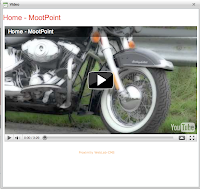
'The moving imagery at the top is very stylish and creative, which works well with the rest of the page'.I agree and disagree with this comment, I agree that it looks stylish and unique, but on the other hand there is a slight problem when it slides off screen, which is hardly noticeable, but you can slightly see it. For the moving imagery I got the inspiration from 'The Script's' website and decided to use it within my website. I like the moving imagery at the top, but I could have imported some more images, as there is only a couple rotating. However, I am pleased with what I have done, and think the overall presentation is professional.
How did you use new media technologies in the construction and research, planning and evaluation stages?
Research - During the research stages of the coursework, I decided to use Google and search for unsigned websites, so I could get a rough idea of the type of genres out there and which ones I could potentially use in my music video. I researched a website called 'Totally Unsigned', they had a facility where you can search for different artists and listen to the type of music they are performing. This new media technology allowed me to search for thousands of musical artists on one page, and this saved me stacks of time. Without this technology, I would have had to look up artists in local libraries, or ask my friends if they know of anyone. I emailed a few people asking if I could have permission to use their music for my video, but I received limited replies.
I then decided to research other social networking sites such as Facebook, YouTube and MySpace. YouTube and MySpace were the most appropriate for the task, as they both contained thousands of artists and I searched for hours, looking for an artist I liked, but I had no luck.
So I decided to look closer to home, as I have a very talented and creative family, I decided to ask my Dad and two of his friends, if I could have permission to use their music and use them in my music video. All three of them agreed, so I had a band I could work with and make the best music video with the equipment I had. With me using my family as my band I could have just asked them for permission verbally, but I wanted to be more professional about it. I wrote a letter out explaining what I had to do and what my idea was and I left room for all three of them to sign it, to say they give me their permission to use their music. This letter is posted on my blog for proof and for future reference.
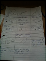
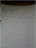
Planning - During the planning for my music video, I created a rough storyboard, to which I could get all of my ideas down on paper and then I could go back to them and add more detail. After planning a rough storyboard, I then free handed the storyboard, and added as much detail in as possible. I planned my storyboard a few weeks before I was ready to film, as I could make changes if the band did not approve of what I originally put down on paper. This was good time management, as I didn’t rush it and in the end I was able to produce a high standard music video.
Video - During the creation of my music video, I used a HD Samsung camera to film my video. I chose this camera as it was high quality, and the shots would be clear and sharp, which would make the overall video crystal clear. I used some photography equipment such as a tripod, this enable to be secured the camera on top and I was able to capture a clear shot. Without this form of equipment, I would have had to film the whole film hand held, which would result in a poor music video. I used Final Cut and iMovie to edit my movie, I found these much easier to use than Adobe Premiere. When creating my video I was referring back to theorists such as Dyer and referring back to the codes and conventions from Pete Fraser.
Website - During the creation of my website I decided to use my Father’s work software, as he is a web developer they have their own piece of software called 'Web Lab', which I found a lot easier to use than 'Dream Weaver'. This media technology allowed me to either work from a template or start from scratch. Also this media technology allowed me to create lots of incredible features such as the moving imagery, the tablet and pop out videos. I used this piece of software to build my website from scratch, using my own imagery that I had photographed and I also used my own imagination to create the tablet at the bottom. The main feature I wanted on my website was the moving imagery at the top, which I was inspired by from 'The Script's' website, and this media technology allowed me to complete this and to make a contemporary and interesting website.
Digipak – During the creation of my Digipak, I used Adobe Photoshop, to create the imagery for my CD. I used all of the original photographs from my camera and selected the best images to use for my CD. By using this media technology it allowed me to experiment with different font sizes, filters, paper sizes and effects. When creating the imagery for my CD, I came across a few problems. When I had finished designing my pages and it came to printing, I had trouble getting them to print back to back. I finally found a way of making sure they were the right size, which was to download a CD template and insert the images on top of the template and print it off. I found that this media technology was really useful, and I would have struggled to get the panels the right size if I didn’t have this technology.
Evaluation- During my evaluation, I used blogger.com to portray my three ancillary tasks and the build up towards my final production. I found that this was an easier way of showing all of my work; it also keeps it all together and tidy. This technology allowed me to upload videos, audio and imagery, so I could make my blog look more interesting instead of just having pages of text. By uploading imagery and videos, the audience can visualise the imagery I am analysing instead of trying to think of what it could be. Blogger.com also gave me the power to embed existing video htmls from YouTube, which is handy for when I am analysing a video, the audience can also see what I am analysing at the same time as reading what I have written. I found this a very useful piece of new media technology when it came to doing video analysis on Bryan Adams and Faith Hill, the audience could view the video on my blog and then read my analysis. Overall, I found blogger a new and very useful tool for the audience to keep up to date with my work and they can view videos and audio at the same time.