 The homepage of 'Snow Patrol' is there to try and market the band. When you first open up the website, this header will appear, this is the original header for the Snow Patrol website. The first thing that stands out is the name of the band, with the background of the website being black, the white, patchy writing stands out from the rest of the page. With the name of the band being so big and bold, it will help the audience to remember the name of the band.
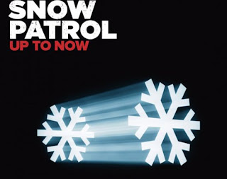
 The header is fairly simple, but eye catching and interesting. They haven't done anything special to it, used basic colours such as black, white and red, which contrasts well. They have identified where you can log in/ register, which is located on the top right hand side of the page. However, the font for the register hyperlink is fairly small, and unnoticeable. Personally I think that they could have me it a little bigger, as they are trying to promote themselves and get the audience to sign up to their website. The font used for the band name is relative as they are called 'Snow Patrol', the writing is giving a snow effect, with a bloody red snowflake to the right of the font. Below the snowflake is an audio player icon, which is supposed to play a track from their album. However, the text which indicates that its an audio player is very faint and unreadable. There are 11 sub headings under the title, which is relevant to the theme 'Snow'. They use the same icongraphy and colour scheme on the CD cover as they have on the website. This shows that they are the same band, by using identical colours and themes.
 This is the main body of the website, I think that the use of iconography is creative. They have took a photograph of one of Snow Patrol's concerts and inserted the image into the website. They have stuck to the colour theme, by changing the crowd to a deep red, this could of been from the lighting at the concert, or just edited in Adobe photoshop. Either way the image still looks effective, especially laid over the black background.
Below the imagery, is a small Text box, which has the latest news about Snow Patrol and where they are touring next. There is a very small image of the one of the band members, next to the imagery is a slogan saying 'SNOW PATROL PLAY THEIR FINAL SHOW ON THE SUMMER'. This is all portrayed in capitals, to get the message across to the audience, it is written in a white font, which is hard to make out. Another article is below which is laid out in the same format as the top article, same colours, font and theme. The only problem is that the article itself is unclear and hard to read at first. They haven't thought about the font very well, as it would be a problem for people who cannot see very well.
 On the left hand side of the page is an advertisement where the public can buy the limited edition box set. This is one way to get the audience interested by advertising the latest gadgets. The advertisement article is very dark and gloomy, with the black background and the red and white writing overlapping. The iconography is black as well, which clashes with the background, they could have changed the colours or made it easier to see. Towards the top of the advert is red blood splatters which connotates evil and danger. The font is all in capitals to grab the public's attention and persuade them to by the items being advertised.
  The designers of the website have inserted a flash image, which is a moving montage of images/ advertisements. This is advertising where Snow Patrol will be playing next which is in a place called ' Ward Park'. They haven't stuck to the theme and colour scheme on this image, however it is still eye catching and effective. 'SNOW PATROL JUNE 2010' is in capitals, situated at the top left hand side of the box. The background is of a sign post in front of a woodland, I particularly like how they have put the 'Snowflake' symbol on the top notice board, to which they will be playing at. The montage then changes to snow patrol t-shirts and other items, to which the public can buy them from the website.

0 comments:
Post a Comment